Data Science · Level 101
Data Science 101 — Could I Be a Data Scientist?
Join Insight Education Analytics — find reliable government data, explore it with Python and SQL, and brief your manager on what you found.
Data Science · Level 101
Data Science 101 — Could I Be a Data Scientist?
Join Insight Education Analytics — find reliable government data, explore it with Python and SQL, and brief your manager on what you found.
Data Science 101 — Could I Be a Data Scientist?
You have joined Insight Education Analytics, a small consultancy that helps education organisations make sense of public data. Your manager is Dr Amara Chen, a senior data scientist who wants you to investigate patterns in A-level subject choices.
Over five modules you will try the work of a junior data scientist:
- Find and organise a real government dataset.
- Inspect the raw data before writing code.
- Set up a professional analysis workspace.
- Explore patterns with Python, pandas and charts.
- Query the data with SQL and send Amara a short findings note.
This is not a generic Python course. You will use official education data to answer a question for a client, while learning what data scientists do day to day: find reliable data, check it, analyse it and explain what it can and cannot show.
Sample student outputs: Worked examples. Your charts should look broadly similar (top subjects, skewed box plot, CS growth over time) — not identical.
The main question behind this work:
What can A-level subject data tell us about who chooses which subjects?
A-level subject choice is not just an education statistic. It affects what people study at university, what careers they imagine are open to them, and who enters fields like computing, maths, engineering, psychology and medicine.
In this course you will download the data, inspect it in Excel, explore it with Python and pandas, and query it with SQL. You are not testing a hypothesis yet — that comes in Data Science 201.
The mindset to keep throughout:
question → data → inspection → cleaning → exploration → statistics → conclusion
Before you start — create your project folder
This matters because programming depends on file paths. If your files are scattered across Downloads, Desktop and random folders, your code will break and you will not know why.
Open File Explorer.
Create a main folder called:
coding
Put it somewhere easy to find, for example:
Documents/coding
Inside coding, create two folders:
data
datascience101
You should now have:
Inside datascience101, create these folders:
notebooks
outputs
report
Inside outputs, create these folders:
charts
tables
You should now have:
Why this structure matters
The rule is:
data = original downloaded files
datascience101 = your notebooks, charts, tables and reports
Keep the downloaded government data in:
coding/data/
Keep your own work in:
coding/datascience101/
Do not manually edit the raw data files. Your code should read them, but you should not change them.
This makes your work easier to debug, easier to explain and easier to extend later.
Tools
- VS Code
- Jupyter Notebook
- Python
- pandas
- matplotlib
- SQLite
If you need packages you have not installed yet:
pip install pandas matplotlib scipy jupyter ipykernelModule 1 — Get the Data
Manager email
From: Dr Amara Chen
Subject: Find the source data
Welcome to Insight Education Analytics. A client wants to understand who chooses different A-level subjects, but before we analyse anything we need the official source data.
Find the Department for Education's 2024/25 A-level results release, keep the original download unchanged, and identify the file containing subject entries over time. Record where it came from so another analyst could find it again.
— Amara
Why this matters
Data scientists spend a surprising amount of time finding, organising and checking data. A polished chart is worthless if nobody can trace its numbers back to a reliable source.
Download the data
Go to this website:
The page is called: A level and other 16 to 18 results
Use the 2024/25 release.
Download the data files for the release.
The download will probably be a ZIP file containing many CSV files.
Save the ZIP file here:
coding/data/
If it downloads to your Downloads folder, move it into:
coding/data/
Extract the ZIP file
Right-click the ZIP file and choose:
Extract All
Extract it into:
coding/data/
After extraction, you should have something like:
The extracted folder name may be slightly different. That is fine.
Inside the extracted folder, find:
alevel_timeseries_subject_entries_results.csv
This is the main CSV you need for Data Science 101 and 201.
Module 2 — Look at the Data in Excel
Manager email
From: Dr Amara Chen
Subject: Inspect before you automate
Thanks for finding the release. Before you write any Python, open the main CSV and work out what one row represents. Identify the fields for subject, year, student characteristic and entry count. Do not change the raw file.
Send me a few notes on anything that could cause an analyst to misread it.
— Amara
Why this matters
Professional analysts do not blindly load unfamiliar files into code. A quick manual inspection helps you understand the structure, spot misleading fields and decide what checks the analysis will need.
Before you write Python code, look at the raw data with your own eyes.
Code is powerful, but you should not blindly run code on a file you have never inspected.
Open the CSV file in Excel:
coding/data/a-level-and-other-16-to-18-results/alevel_timeseries_subject_entries_results.csv
If the extracted dataset folder has a slightly different name, open that folder and find:
alevel_timeseries_subject_entries_results.csv
Double-click it to open it in Excel.
If Excel asks about delimiters or separators, choose comma-separated or accept the default if the columns appear correctly.
What you are looking at
A CSV is a table.
The table has:
columns
rows
cells
Columns, headers and fields
A column is a vertical field of data.
Each column has a name at the top. That name is called a:
column header
In data work, columns are also often called:
fields
For example, this file has fields such as:
time_period
subject_name
characteristic_value
entry_count
Each field should ideally contain one type of thing.
For example:
entry_count should contain numbers
subject_name should contain subject names
time_period should contain years
This is similar to a database table, where each column has a name and an expected data type.
It also loosely maps to object-oriented programming:
field = attribute/property
For example, if each row were an object, it might have properties like:
row.subject_name
row.time_period
row.entry_count
Do not worry about object-oriented programming yet. The useful idea is simply:
a field describes one property of the thing in the row
Rows
A row is a horizontal record in the table.
Ideally, one row should represent one data entity or observation.
In this dataset, a row is not just “a subject”.
A row is more specific than that.
A row is something like:
Accounting and finance
England
National
2024/25
Female
591 entries
So the row is one observation for:
one subject
one year
one geography
one student category
This is similar to a row in a database table.
It also loosely maps to an object in programming:
row = one object/record
columns = the properties of that object
The practical rule is:
Before analysing a dataset, understand what one row represents.
That question is one of the most important questions in data analysis.
Cells
A cell is one value at the intersection of a row and a column.
For example:
subject_name = Computer science
characteristic_value = Female
entry_count = 1234
Each cell should ideally contain one simple value, not a whole paragraph or multiple mixed values.
What to do in Excel
Spend five minutes exploring.
Do not edit the file.
Just look.
Answer these questions in your notebook or in a separate note:
What does one row represent?
What are the most important columns?
Which column contains the subject?
Which column contains the year?
Which column contains Female/Male/All students?
Which column contains the count?
Are there columns with percentages?
Does the file look tidy, or are there merged/messy cells?
Then close Excel without saving changes.
If Excel asks whether you want to save changes, choose:
Don't Save
The raw data should remain unchanged.
Why not just use Excel?
Excel is useful.
It is good for opening files, looking at data and doing quick checks.
But this dataset is better handled in Python because:
1. It may be large.
Government datasets can have many rows and many CSV files. Excel can become slow, messy or awkward.
2. Python makes repeatable steps.
If you filter or calculate something in Excel by clicking around, it is easy to forget exactly what you did. In Python, the notebook records every step.
3. Python is better for reshaping data.
Real datasets are often not arranged in the exact table you want. Python can filter, group, pivot and summarise the data quickly.
4. Python has richer analysis tools.
You can use statistics, charts, tests, reusable functions and later machine learning tools from the same environment.
5. Python helps you scale.
The same tools work whether the dataset has 100 rows, 100,000 rows or several million rows.
Excel is useful. But for this kind of project, Python gives you more control.
Module 3 — Set up Python & Jupyter
Manager email
From: Dr Amara Chen
Subject: Set up a reproducible workspace
The team needs your analysis to be easy to rerun and review. Set up the project in VS Code, create a Jupyter notebook in the correct folder, select a Python kernel and verify that the required packages load.
Keep raw data, code and outputs separate. That habit matters as much as the first lines of Python.
— Amara
Why this matters
A data scientist's work must survive beyond one laptop session. Clear folders, saved notebooks and a working environment make an analysis reproducible for colleagues and for your future self.
Before you start writing code, understand the tools.
What is Jupyter?
Jupyter is a way of writing code in small runnable blocks called cells.
A Jupyter notebook is a file ending in:
.ipynb
A notebook can contain:
- normal written explanations;
- Python code;
- tables;
- charts;
- outputs from the code.
That makes it useful for data analysis, because you can explain what you are doing, run the code, see the result, and then write what the result means.
A normal Python file is usually just code.
A notebook is more like a working scientific report.
Can Jupyter work online?
Yes.
Jupyter notebooks can run in several ways.
For example:
1. Online, in a browser
Tools like Google Colab or hosted JupyterLab let you run notebooks online.
2. Locally, on your own computer
You can run Jupyter using software installed on your laptop.
3. Inside VS Code
VS Code can open and run Jupyter notebooks if you install the Python and Jupyter extensions.
So Jupyter is not one specific website.
Jupyter is the notebook format and way of working.
Why are we using VS Code?
For this project, you are going to use:
VS Code + Jupyter notebooks
That means:
VS Code = the editor where you organise files and write code
Jupyter notebook = the document where you write notes and run code cells
Python kernel = the Python process that actually runs your code
We are using VS Code because this project is not only about running a few code cells.
It is also about learning how a real data project is organised:
folders
raw data
notebooks
outputs
charts
reports
VS Code makes that structure visible. You can see your folders on the left, open your notebook, save charts and keep your report in the same project.
Online notebooks are convenient, but they can hide the file structure. You often have to upload data, mount storage or download outputs manually. That is fine for quick experiments, but less useful when you are learning how to manage a proper project on your own computer.
For this project, VS Code gives you the best balance:
notebook-style learning
+
real local project structure
When would an online notebook be better?
If your setup breaks and you cannot get Python running locally, an online notebook such as Google Colab is a good fallback.
It is easier to start quickly.
But the main version of this project uses VS Code because it teaches better habits for working with real files and datasets.
Install and set up VS Code notebooks
You will use:
Python
VS Code
Jupyter notebook files
pandas
matplotlib
scipy
SQLite
SQL
These tools work together:
Python runs the analysis.
VS Code organises the project.
Jupyter notebooks let you mix explanation, code, tables and charts.
pandas works with data tables.
matplotlib makes charts.
scipy runs the statistical test.
SQLite stores data in a small local database.
SQL queries data from database tables.
Install VS Code extensions
Open VS Code.
Look at the left-hand side toolbar.
Click the Extensions icon.
Search for and install:
Python
Then search for and install:
Jupyter
These extensions let VS Code understand Python files and notebook files.
Open the project folder
In VS Code, choose:
File > Open Folder
Open:
coding/datascience101
Do not open the data folder as your project.
You are working in datascience101, but your notebook will read the raw data from the nearby data folder.
In the VS Code Explorer panel, you should see:
notebooks
outputs
report
If you do not see those folders, you may have opened the wrong folder.
Create your first notebook
In the VS Code Explorer panel:
- Right-click the
notebooksfolder. - Choose New File.
- Name the file:
00_explore_a_level_data.ipynb
Press Enter.
VS Code should open a notebook editor.
This notebook is for exploring the dataset in Python.
Where is Jupyter running?
Jupyter is not a separate website for this project.
It is running inside VS Code.
More precisely:
VS Code = the editor you see
Jupyter extension = the notebook interface inside VS Code
Python kernel = the Python process that actually runs your code
When you run a code cell, VS Code sends that code to a Python process on your computer. That Python process is called the kernel.
The kernel remembers variables while the notebook is open.
For example, if you run:
x = 10
then a later cell can use:
x + 5
because the kernel remembers that x exists.
If you restart the kernel, it forgets everything and you need to run the earlier cells again.
That is normal.
Select the Python kernel
At the top right of the notebook, VS Code may show something like:
Select Kernel
Click it.
Choose a Python environment.
It may be called something like:
Python 3.x
or:
.venv
or:
base
For this first project, choose the normal Python 3 option.
If VS Code asks to install notebook support or ipykernel, accept it.
If you see a message about installing ipykernel, you can also install it in the terminal:
pip install ipykernel
Test that the notebook works
In 00_explore_a_level_data.ipynb, create a code cell and run:
print("Hello, data project")
To run a cell, click the small play button next to the cell.
You should see:
Hello, data project
If that works, your notebook is running Python correctly.
Install the packages if needed
Open the VS Code terminal:
Terminal > New Terminal
Run:
pip install pandas matplotlib scipy jupyter ipykernel
These packages are used for:
pandas = working with tables
matplotlib = making charts
scipy = statistical tests
jupyter/ipykernel = running notebooks
After installing, go back to the notebook and run:
import pandas as pd
import matplotlib.pyplot as plt
from scipy.stats import binomtest
import sqlite3
print("Packages loaded")
If you see:
Packages loaded
you are ready.
Save the notebook
VS Code usually autosaves if autosave is enabled, but do not rely on that.
Use:
File > Save
or press:
Ctrl + S
Save regularly.
Module 4 — Explore in Python
Manager email
From: Dr Amara Chen
Subject: What patterns should the client know about?
Now explore the dataset in Python. Check its shape and fields, identify the most popular subjects, summarise entry counts and investigate how Computer Science entries have changed over time.
Include clear charts and finish with notes on what surprised you, what the data makes easy to answer and what it cannot explain.
— Amara
Why this matters
Exploratory data analysis is how data scientists learn what a dataset contains before making stronger claims. The aim is not to hunt for a dramatic result; it is to find useful patterns, anomalies and limitations.
Now you are ready to use the notebook.
The next sections go inside:
notebooks/00_explore_a_level_data.ipynb
Load the data
Question
Can Python read the dataset?
Code
import pandas as pd

path = "../../data/a-level-and-other-16-to-18-results/alevel_timeseries_subject_entries_results.csv"

df = pd.read_csv(path)

df.head()
What the code does
import pandas as pd loads pandas, the main Python library for working with tables.
path tells Python where the CSV file is.
pd.read_csv(path) loads the CSV into a DataFrame called df.
df.head() shows the first five rows.
If the file does not look right, try:
df = pd.read_csv(path, sep="\t")
df.head()
This tells pandas to treat the file as tab-separated.
Get a first feel for the data
Question
How big is this dataset, and what fields does it contain?
Code
df.shapeWhat the code does
This shows the number of rows and columns.
The result is:
(number_of_rows, number_of_columns)
Code
df.columnsWhat the code does
This lists the field names.
A field is a column in the dataset.
Code
df.dtypesWhat the code does
This shows the data type of each column.
For example, it tells you whether entry_count is being treated as a number.
List the years and subjects
Question
What years and subjects are included?
Code
df["time_period"].sort_values().unique()What the code does
This selects the time_period column, sorts it, and shows each year once.
Code
df["subject_name"].nunique()What the code does
This counts how many different subjects are in the file.
Code
df["subject_name"].sort_values().unique()What the code does
This lists all subject names alphabetically.
This is useful because official datasets often use slightly different names from the ones you expect.
Simple tallies
Question
How many rows are there for each student category?
Code
df["characteristic_value"].value_counts()What the code does
This counts how often each value appears in the characteristic_value column.
You should see values such as:
All students
Female
Male
This tells you that the file contains separate rows for each group.
Most popular subjects in the latest year
Question
Which A-level subjects had the most entries in 2024/25?
Code
latest = df[

    (df["time_period"] == 202425) &

    (df["country_name"] == "England") &

    (df["geographic_level"] == "National") &

    (df["characteristic_value"] == "All students")

].copy()

latest_subjects = latest.sort_values("entry_count", ascending=False)

latest_subjects[["subject_name", "entry_count"]].head(20)
What the code does
This filters the dataset to:
- 2024/25;
- England;
- national-level data;
All students, so you get total entries rather than gender-specific rows.
It then sorts subjects by entry_count, from largest to smallest.
The final line shows the top 20 subjects.
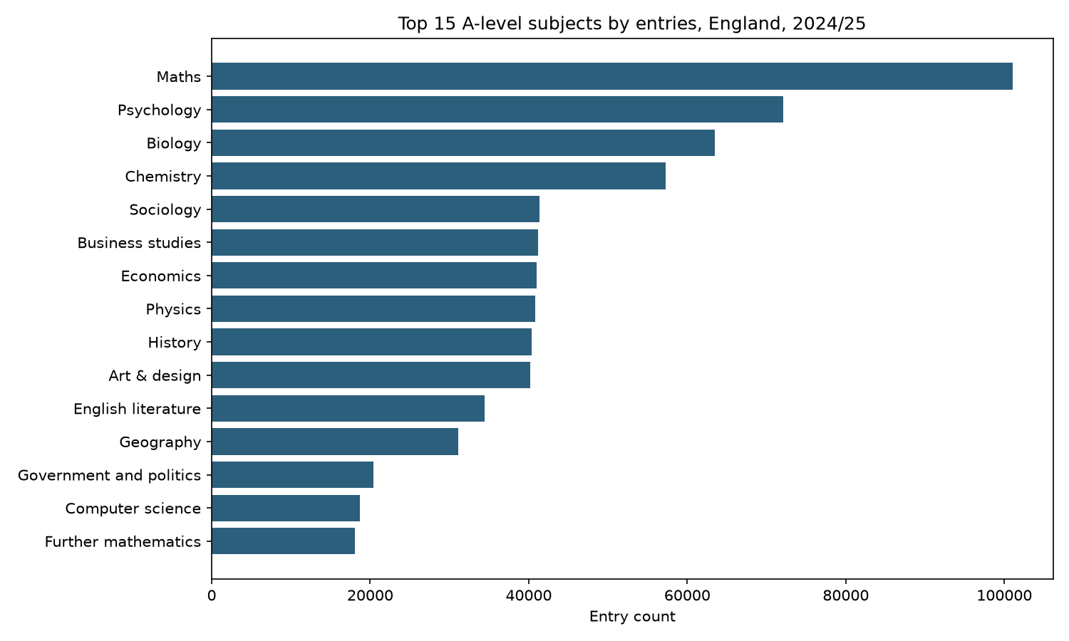
Chart the most popular subjects
Question
Can you visualise the biggest A-level subjects?
Code
import matplotlib.pyplot as plt

top_15 = latest_subjects.head(15)

plt.figure(figsize=(10, 6))

plt.barh(top_15["subject_name"], top_15["entry_count"])

plt.xlabel("Entry count")

plt.title("Top 15 A-level subjects by entries, England, 2024/25")

plt.gca().invert_yaxis()

plt.show()
What the code does
This makes a horizontal bar chart.
top_15 keeps only the 15 subjects with the most entries.
plt.barh(...) creates a horizontal bar chart.
invert_yaxis() puts the largest subject at the top.
This is a simple tool you will use again and again:
filter → sort → take the top rows → chart them
Compare with the sample top-15 chart (aggregates such as “Total subjects” excluded).
Descriptive statistics
Question
How spread out are subject entry counts?
Code
latest_subjects["entry_count"].describe()What the code does
This gives summary statistics for entry counts.
It includes:
- count;
- mean;
- standard deviation;
- minimum;
- quartiles;
- maximum.
The mean tells you the average number of entries per subject.
The standard deviation tells you how spread out the subject entry counts are.
A large standard deviation means some subjects are much bigger than others.
Code
latest_subjects["entry_count"].median()What the code does
This gives the median number of entries.
The median is often useful when the data is skewed.
For example, if a few subjects are huge, the mean may be pulled upwards. The median gives a better sense of the “typical” subject.
Box plot
Question
Are most subjects similar in size, or are there big outliers?
Code
plt.figure(figsize=(8, 4))

plt.boxplot(latest_subjects["entry_count"], vert=False)

plt.xlabel("Entry count")

plt.title("Distribution of A-level subject entry counts, England, 2024/25")

plt.show()
What the code does
This creates a box-and-whisker plot.
A box plot shows:
- the middle range of the data;
- the median;
- the spread;
- possible outliers.
This is useful because some A-level subjects are very large and others are tiny.
A box plot helps you see the shape of the dataset before you over-interpret percentages.
Look at grade outcome columns
Question
What grade outcome fields are available?
Code
grade_columns = [col for col in df.columns if "perc_" in col]

grade_columns
What the code does
This finds all columns whose names contain perc_.
These are percentage outcome columns, such as the percentage achieving A*–A or A*–B.
Code
latest_subjects[["subject_name", "entry_count"] + grade_columns].head(10)What the code does
This shows the top subjects along with their entry counts and grade outcome percentages.
This is a preview of what you could analyse later.
Chart one grade outcome
Question
Which subjects have the highest A*–B percentage?
Code
top_grade_subjects = latest_subjects.sort_values(

    "perc_astar_b_grade_achieved",

    ascending=False

).head(15)

plt.figure(figsize=(10, 6))

plt.barh(top_grade_subjects["subject_name"], top_grade_subjects["perc_astar_b_grade_achieved"])

plt.xlabel("% achieving A*–B")

plt.title("Top subjects by A*–B percentage, England, 2024/25")

plt.gca().invert_yaxis()

plt.show()
What the code does
This sorts subjects by the percentage achieving A*–B.
It then charts the top 15.
This is not yet a serious conclusion. It is exploration.
You would need to think carefully about entry counts, subject difficulty, student selection and other factors before interpreting this deeply.
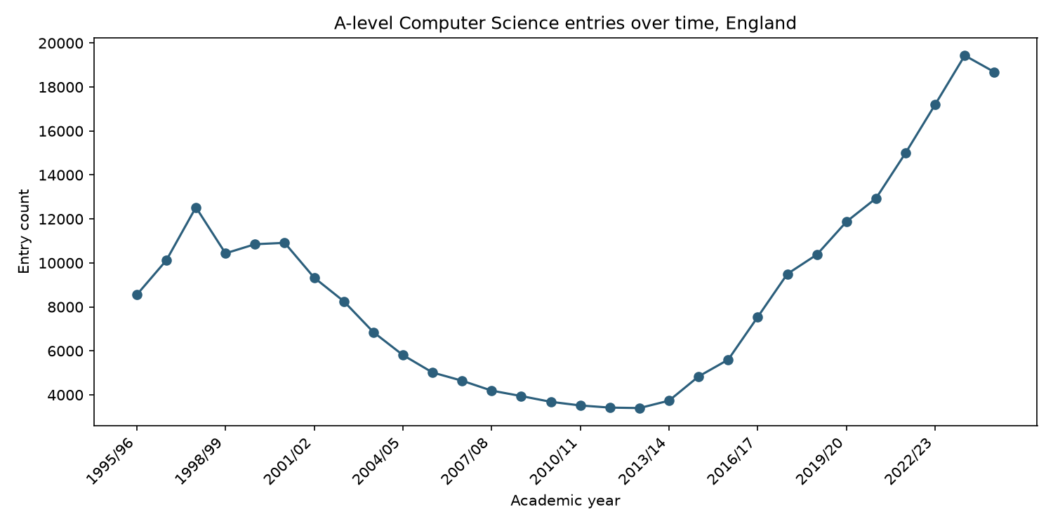
Entry counts over time for one subject
Question
Has Computer Science grown over time?
Code
computer = df[

    (df["country_name"] == "England") &

    (df["geographic_level"] == "National") &

    (df["subject_name"] == "Computer science") &

    (df["characteristic_value"] == "All students")

].copy()

computer[["time_period", "entry_count"]].head()
What the code does
This filters the dataset to Computer Science total entries across all years.
Code
plt.figure(figsize=(10, 5))

plt.plot(computer["time_period"], computer["entry_count"], marker="o")

plt.xlabel("Academic year")

plt.ylabel("Entry count")

plt.title("A-level Computer Science entries over time, England")

plt.show()
What the code does
This creates a line chart showing Computer Science entries over time.
Line charts are useful when the order of the x-axis matters, such as years.
See the sample Computer Science time series.
If this returns no rows, search for the exact subject name:
[x for x in df["subject_name"].unique() if "computer" in x.lower()]
What did you notice?
At the end of the notebook, write a few notes.
Use prompts like:
What surprised me?
Which subjects are largest?
Are there tiny subjects where percentages might be misleading?
Which fields might be useful for a later project?
What does the dataset make easy to analyse?
What does the dataset not explain?
This is important.
Exploration is not just clicking around. It is learning what the dataset can and cannot tell you.
Module 5 — Query with SQL
Manager email
From: Dr Amara Chen
Subject: Reproduce the findings in SQL
Our client's data team stores its records in databases rather than CSV files. Load the A-level data into SQLite and answer the same kinds of questions with SQL: filter records, rank subjects, group totals and join related tables.
Then write a short handover note telling me what you found and which tool you would use next time.
— Amara
Why this matters
Most working data scientists use both Python and SQL. SQL retrieves and shapes data where it is stored; Python supports deeper analysis, visualisation and automation.
After you have explored the data in Python, do a second version using a small database.
This is not because SQL is better than Python.
It is because SQL is another core data skill.
Python and SQL are often used together:
SQL = get, filter, group and join data
Python = analyse, chart, test and automate
For this extension, you will load the same CSV into a local SQLite database.
SQLite is a simple database that lives in a single file on your computer.
You do not need to install a database server.
Why learn this?
Many real datasets live in databases, not CSV files.
SQL teaches you to think in tables:
SELECT columns
FROM a table
WHERE conditions are true
GROUP BY categories
ORDER BY results
JOIN tables together
This maps nicely onto what you have already done in pandas.
The point is to see that the same question can be answered in different tools.
Create a database from the CSV
Question
Can you load the A-level CSV into a SQLite database?
Code
import pandas as pd

import sqlite3

path = "../../data/a-level-and-other-16-to-18-results/alevel_timeseries_subject_entries_results.csv"

df = pd.read_csv(path)

conn = sqlite3.connect("../outputs/alevel_project.db")

df.to_sql("alevel_entries", conn, if_exists="replace", index=False)
What the code does
sqlite3 is Python's built-in library for working with SQLite databases.
sqlite3.connect(...) creates a database file called:
alevel_project.db
inside your outputs folder.
df.to_sql(...) copies the DataFrame into a database table called:
alevel_entries
if_exists="replace" means that if the table already exists, Python will replace it.
index=False means pandas should not add an extra index column.
After this step, your CSV data is now inside a database table.
Run your first SQL query
Question
Can you read the first few rows from the database?
Code
query = """

SELECT *

FROM alevel_entries

LIMIT 5;

"""

pd.read_sql_query(query, conn)
What the SQL does
SELECT * means:
show all columns
FROM alevel_entries means:
use the table called alevel_entries
LIMIT 5 means:
only show five rows
pd.read_sql_query(...) runs the SQL query and returns the result as a pandas DataFrame.
Select specific fields
Question
Can you choose only the columns you need?
Code
query = """

SELECT

    time_period,

    subject_name,

    characteristic_value,

    entry_count

FROM alevel_entries

LIMIT 10;

"""

pd.read_sql_query(query, conn)
What the SQL does
Instead of selecting every column, this query selects only four fields:
time_period
subject_name
characteristic_value
entry_count
This is often better than SELECT * because it makes your query clearer.
Filter rows with WHERE
Question
Can you filter to 2024/25 national England data?
Code
query = """

SELECT

    subject_name,

    characteristic_value,

    entry_count

FROM alevel_entries

WHERE time_period = 202425

  AND country_name = 'England'

  AND geographic_level = 'National'

LIMIT 20;

"""

pd.read_sql_query(query, conn)
What the SQL does
WHERE filters the rows.
This query keeps only rows where:
time_period = 202425
country_name = England
geographic_level = National
The AND means all conditions must be true.
This is the SQL version of filtering a pandas DataFrame.
Order and limit results
Question
Which subjects had the most entries in 2024/25?
Code
query = """

SELECT

    subject_name,

    entry_count

FROM alevel_entries

WHERE time_period = 202425

  AND country_name = 'England'

  AND geographic_level = 'National'

  AND characteristic_value = 'All students'

ORDER BY entry_count DESC

LIMIT 15;

"""

pd.read_sql_query(query, conn)
What the SQL does
ORDER BY entry_count DESC sorts the results from largest to smallest.
LIMIT 15 keeps only the top 15 rows.
This answers the same kind of question you answered earlier in pandas.
Group by
Question
How many rows are there for each student category?
Code
query = """

SELECT

    characteristic_value,

    COUNT(*) AS row_count

FROM alevel_entries

GROUP BY characteristic_value

ORDER BY row_count DESC;

"""

pd.read_sql_query(query, conn)
What the SQL does
GROUP BY characteristic_value groups rows by student category.
COUNT(*) counts the number of rows in each group.
AS row_count gives the count column a clearer name.
This is the SQL version of:
df["characteristic_value"].value_counts()
Group by subject and calculate totals
Question
Can SQL calculate total entries by subject?
Code
query = """

SELECT

    subject_name,

    SUM(entry_count) AS total_entries

FROM alevel_entries

WHERE time_period = 202425

  AND country_name = 'England'

  AND geographic_level = 'National'

  AND characteristic_value = 'All students'

GROUP BY subject_name

ORDER BY total_entries DESC

LIMIT 15;

"""

pd.read_sql_query(query, conn)
What the SQL does
SUM(entry_count) adds entry counts.
GROUP BY subject_name means the sum is calculated separately for each subject.
This query gives the biggest subjects by entry count.
Join female and male rows
Question
Can SQL combine Female and Male rows into one subject-level table?
This is where JOIN becomes useful.
In the raw data, Female and Male entries are in separate rows.
A join lets you combine matching rows.
Code
query = """

SELECT

    f.subject_name,

    f.entry_count AS female_entries,

    m.entry_count AS male_entries,

    (f.entry_count + m.entry_count) AS total_entries,

    ROUND(100.0 * f.entry_count / (f.entry_count + m.entry_count), 1) AS pct_female

FROM alevel_entries AS f

JOIN alevel_entries AS m

  ON f.subject_name = m.subject_name

 AND f.time_period = m.time_period

 AND f.country_name = m.country_name

 AND f.geographic_level = m.geographic_level

WHERE f.time_period = 202425

  AND f.country_name = 'England'

  AND f.geographic_level = 'National'

  AND f.characteristic_value = 'Female'

  AND m.characteristic_value = 'Male'

ORDER BY pct_female ASC

LIMIT 20;

"""

pd.read_sql_query(query, conn)
What the SQL does
This query uses the same table twice.
alevel_entries AS f means:
treat one copy of the table as the Female rows
alevel_entries AS m means:
treat another copy of the table as the Male rows
The JOIN matches Female and Male rows where they have the same:
subject_name
time_period
country_name
geographic_level
Then the query calculates:
female entries
male entries
total entries
% female
This is similar to a pandas pivot, but written in SQL.
Create a tiny second table and join it
Question
Can you join the A-level data to your own small classification table?
Real databases often have multiple tables.
For example, one table might contain entries, while another table contains subject groups.
You can create a tiny subject tagging table yourself.
Code
subject_tags = pd.DataFrame({

    "subject_name": [

        "Computer science",

        "Mathematics",

        "Further mathematics",

        "Physics",

        "Sociology",

        "Psychology"

    ],

    "subject_group": [

        "STEM",

        "STEM",

        "STEM",

        "STEM",

        "Social science",

        "Social science"

    ]

})

subject_tags.to_sql("subject_tags", conn, if_exists="replace", index=False)
What the code does
This creates a small DataFrame with two columns:
subject_name
subject_group
Then it saves it as a second SQLite table called:
subject_tags
Now your database has two tables:
alevel_entries
subject_tags
Code
query = """

SELECT

    e.subject_name,

    t.subject_group,

    e.entry_count

FROM alevel_entries AS e

JOIN subject_tags AS t

  ON e.subject_name = t.subject_name

WHERE e.time_period = 202425

  AND e.country_name = 'England'

  AND e.geographic_level = 'National'

  AND e.characteristic_value = 'All students'

ORDER BY e.entry_count DESC;

"""

pd.read_sql_query(query, conn)
What the SQL does
This joins the official A-level data to your own subject group table.
JOIN subject_tags AS t brings in the subject group.
ON e.subject_name = t.subject_name tells SQL how to match the two tables.
This is a basic but important database idea:
tables can be connected by shared fields
Pandas vs SQL: which is better?
Neither is simply better.
They are good at different things.
Pandas strengths
Pandas is good for:
- quick exploration;
- charts;
- calculations;
- reshaping data;
- statistical tests;
- working inside a notebook;
- combining analysis and explanation.
SQL strengths
SQL is good for:
- filtering large tables;
- selecting only needed columns;
- grouping and aggregating;
- joining multiple tables;
- working with data stored in databases;
- writing clear reusable data queries.
Pandas weaknesses
Pandas can become messy if:
- the dataset is very large;
- you write many complicated steps;
- you need to join lots of tables;
- you do not name intermediate DataFrames clearly.
SQL weaknesses
SQL can feel awkward for:
- charts;
- statistical testing;
- complex custom calculations;
- step-by-step notebook explanation;
- exploratory work where you keep changing your mind.
The practical answer
Use both.
A common real-world workflow is:
SQL to fetch and shape the data
Python/pandas to analyse, chart and test it
In this project, you are learning both ways of thinking.
SQL mini-summary
The main SQL statements you have used are:
SELECT column_name
FROM table_name;
Choose columns from a table.
WHERE condition;
Filter rows.
ORDER BY column_name DESC;
Sort results.
LIMIT 10;
Keep only a fixed number of rows.
GROUP BY column_name;
Group rows so you can count or sum them.
COUNT(*)
SUM(column_name)
Aggregate rows.
JOIN other_table
ON table1.field = table2.field;
Combine related tables.
These are enough to start doing useful database work.
Send Amara your handover note
Create:
report/data_science_101_handover.md
A sample handover is on Worked examples.
In about 250 words, include:
- two patterns you found in the A-level data;
- one chart or table that best supports those findings;
- one limitation that stops you making a stronger claim;
- whether Python or SQL felt more natural for this task, and why;
- one question you would investigate next.
This is the final part of the job. Data science is not complete when the code runs; someone else must be able to understand and use the result.
Module 6 — What You Have Learned
By the end of Data Science 101, you have learned to:
- find and preserve an official source dataset;
- open a CSV in Excel and understand its basic table structure;
- explain what columns, fields, rows and cells are;
- organise a reproducible data project;
- load and inspect a dataset in Python;
- count subjects and categories;
- make bar, box and time-series charts;
- calculate mean, median and standard deviation;
- load the same CSV into SQLite;
- answer similar questions using SQL;
- use
SELECT,WHERE,GROUP BY,ORDER BY,LIMITandJOIN; - write a short handover that separates findings from limitations.
These are basic tools you can use across almost any dataset. They are also a first taste of the job: patient checking, structured problem-solving, coding and explaining evidence clearly.
Could you be a data scientist?
Think back over the week:
- Did you enjoy turning a broad client question into smaller data questions?
- Did checking fields and totals feel satisfying, or only frustrating?
- Did you like moving between code, charts and written explanation?
- Were you comfortable saying what the data could not prove?
You do not need to love every tool. If you enjoyed finding patterns, checking your reasoning and making evidence understandable, data science may be worth exploring further.
Continue to Data Science 201 — Becoming a Data Scientist to return to Insight Education Analytics and test a client question properly.