Computer Vision (Developer) · Level 101
Computer Vision Developer 101 — Build Your First Land-Cover Classifier
Join PDLL as a junior developer — implement the CNN pipeline in code, from RGB arrays to a trained classifier on synthetic tiles.
Computer Vision (Developer) · Level 101
Computer Vision Developer 101 — Build Your First Land-Cover Classifier
Join PDLL as a junior developer — implement the CNN pipeline in code, from RGB arrays to a trained classifier on synthetic tiles.
Computer Vision Developer 101 — Build Your First Land-Cover Classifier
Prerequisite: Data Science 101.
This course assumes you can use VS Code, Jupyter Notebooks, Python and matplotlib. You will write Python code from the instructions below.
Prefer interpreting maps and writing briefs without building models? Take Computer Vision Analyst 101 instead — same PDLL setting, minimal implementation.
Who this course is for
Developers and coders training at the fictional Peak District Landscape Lab (PDLL) who want to implement the CNN pipeline — not only read the maps.
External learners: Use synthetic and public datasets (EuroSAT in 201). You do not need APGB aerial access.
What PDLL mirrors: The real Peak District CNN project (public details only — no real staff names in this course).
The published project PDLL is modelled on
Since 2023, Peak District National Park — with Cranfield University and the Alan Turing Institute — has published work on using CNNs to map the whole national park (1,439 km²) from Bluesky aerial photography at 12.5 cm ground resolution, via the Aerial Photography Great Britain (APGB) contract.
That published approach (press release, 2023):
- Split orthophotos into 64 m × 64 m patches (512 × 512 pixels).
- Hand-label 1,027 patches using a detailed UK habitat schema (Taylor et al., 1991).
- Train CNNs in multiple stages — broad classes first (moorland, woodland, grassland, ~95% accuracy), then finer subclasses (heather moor, deciduous woodland, wet grassland and rush pasture, typically 72–92%).
- Merge predictions with Ordnance Survey topographic data for a complete map.
That work supports Landscape Recovery, nature recovery monitoring, and species programmes such as water vole habitat assessment. Researchers are also exploring change detection between 2010 and 2020 imagery (Alan Turing Institute Data Study Group, 2023).
Public data and code: github.com/pdnpa/cnn-land-cover.
Your manager at PDLL is Andy Ipping (Senior Data Analyst — yes, the initials are deliberate). His job in this fictional programme is to make sure you understand the CNN pipeline — not just the GIS output — before you touch real operational maps anywhere.
How this course maps to that published work
| Module | What you practice in PDLL | Step in the published project |
|---|---|---|
| 1 | Why high-resolution land cover matters | Monitoring gap since the 1991 survey |
| 2 | Images as RGB number grids | Bluesky APGB 12.5 cm tiles |
| 3 | Convolution filters | Low-level pattern detection inside CNNs |
| 4 | Multi-stage CNN pipeline | High-level pass, then subclass pass |
| 5 | Train a tiny classifier | Simplified version of patch labelling |
| 6 | Reflection | Ready for CNN 201 and public datasets |
Over five modules you will:
- Understand why organisations invest in CNN mapping — and what rangers use the output for.
- Open an aerial image and see it as a grid of numbers (pixels).
- Run simple filters that highlight edges and textures — the same operation CNNs automate.
- Learn how multi-stage CNNs turn patterns into habitat labels.
- Train a tiny classifier on synthetic Peak District-style tiles (stand-in
until EuroSAT in 201 or the public
pdnpa/cnn-land-coverpatches).
The mindset to keep throughout:
Bluesky photo → pixels → patterns → habitat label → 1,439 km² map
Before you start — create your project folder
Copy the developer starter kit
(cnn-developer-101-starter.zip)
or create folders manually:
# After downloading and extracting the zip into ~/coding/vision101
cd ~/coding/vision101
See also the glossary and worked example charts.
Or create manually: a folder called vision101 inside your coding folder:
Open VS Code. Choose File → Open Folder and open vision101.
You will save notebooks in notebooks/, charts in outputs/charts/, and
short written answers in report/.
Install Python packages (one time)
Use Python 3.10 or 3.11 if you can — TensorFlow does not support every bleeding-edge Python version on all machines.
python3 -m venv .venv
source .venv/bin/activate          # Windows: .venv\Scripts\activate
pip install -r requirements.txt    # or: pip install numpy matplotlib pillow jupyter ipykernel scikit-learn tensorflow
TensorFlow is a large download (~5–10 minutes on good Wi-Fi). Module 5 training takes about 1–2 minutes on a typical laptop.
If install fails — try this order
- Google Colab — upload notebooks; TensorFlow is pre-installed. Skip local
pip installand save outputs to Google Drive or download charts manually. - Python 3.11 venv —
python3.11 -m venv .venvthen install again. - School IT — ask whether TensorFlow is allowed on managed laptops.
- Teacher / mentor — share the exact error message, not just “it didn’t work.”
Expected outputs (check your work)
Sample student outputs: Worked examples. Your charts should look broadly similar (three-band tile, greenness line high at top, edge boundaries glowing, prediction map matching three stripes).
Viewing images and charts you save
Whenever code writes a .png file:
- In the notebook — keep
plt.show()(ordisplay(...)) in the same cell so the image appears inline below the code. - In VS Code — click the file in Explorer (e.g.
data/peak_tile.pngoroutputs/charts/module2_green_profile.png). VS Code opens a preview so you see the actual picture, not just a file path. - Check both — the notebook view and the saved file should match. If they do not, re-run the cell before continuing.
Tools
- VS Code
- Jupyter Notebook
- Python
- numpy
- matplotlib
- Pillow (for reading images)
- TensorFlow (for the tiny neural network in Module 5)
Module 1 — Why Map From Above?
Manager email
From: Andy Ipping
Subject: Welcome — understand the map before you trust itWelcome to the Peak District Landscape Lab — a fictional training team. Before I point you at our teaching materials or the public
pdnpa/cnn-land-coverrepository, I need you to understand why real national parks invest in CNN mapping and what rangers do with the output.The last time land cover was mapped in this detail across UK national parks was 1991. Manual interpretation cannot keep pace with Landscape Recovery, nature recovery targets, or questions like "where is wet grassland fragmenting?" Published work from the Peak District — with Cranfield and the Turing Institute — shows how Bluesky APGB photos and two-pass CNNs can help.
Your first task is research, not coding. Read that published work (start with the 2023 press release and the Turing impact story). Then send me a one-page note answering:
- Why can't a park rely on walking every field and moor anymore?
- Name one documented use of the published land-cover map.
- What would you ask before showing a CNN map to a ranger?
No Python today.
— Andy
Why this matters
The published CNN maps are not an academic exercise. They feed decisions about where to restore habitats, nature recovery tracking, and field work — for example, where to survey for water voles beyond obvious stream edges.
A junior analyst who only clicks layers in QGIS will eventually misread a map. Someone who understands pixels, filters and staged classification can ask the right questions before a grazing or planting decision.
What you'll learn
- What the published Peak District CNN project delivers and who uses it
- How Bluesky APGB photography differs from coarse satellite summaries
- The roles of Cranfield University and the Alan Turing Institute in the research
- How to read a habitat map critically before briefing colleagues
Who was involved in the published project
| Role | Organisation | Contribution |
|---|---|---|
| National park | Peak District NPA | Local habitat knowledge, labels, operational use |
| Remote sensing | Cranfield University | Method design, earth observation expertise |
| AI research | Alan Turing Institute | Multi-stage CNN development, change detection |
| Imagery supply | Bluesky (APGB contract) | 12.5 cm RGB orthophotos across 1,439 km² |
(PDLL is fictional; the table describes real published partners.)
Your tasks
Create a new file:
report/module1_land_mapping_research.md
Answer the following in clear prose (roughly 300–500 words total).
Task 1 — Why CNN mapping for a national park?
In your own words, explain at least two reasons a park might map from aerial photos instead of field survey alone. Use real context from the published project: 1,439 km², mixed ownership, upland access, Landscape Recovery, repeat monitoring every few years.
Task 2 — One documented use
From the press release or Turing impact page, describe one way the published map is used in practice (not a hypothetical). Quote or paraphrase accurately.
Task 3 — Questions for rangers
List two questions you would ask a ranger or ecologist before they rely on a CNN-derived habitat boundary.
Reflection questions
- Would you rather visit the Peak District in person or analyse it from a laptop?
- How comfortable are you with answers that are "probably grassland" rather than perfectly certain?
- Do you like the idea of your code affecting real conservation decisions?
Manager feedback
From: Andy Ipping
Good first step. The clients who pay us do not care about "AI" as a buzzword. They care whether the grazing map helps them avoid over-grazing Kinder Scout or whether the woodland layer matches what rangers see on the ground.
Tomorrow we open an image file and stop treating it as a picture. We treat it as a table of numbers.
— Andy
AQA Mathematics links
- Scale and area — mapping km² of land cover
- Sampling — checking a few ground-truth fields to validate a map
Beyond A-Level
Look up the public repository github.com/pdnpa/cnn-land-cover and the Remote Sensing paper on multi-stage semantic segmentation across the PDNP (Plas et al., 2023).
Module 2 — Images as Numbers
Manager email
From: Andy Ipping
Subject: Your first aerial tile — same idea as Bluesky, smaller fileProduction maps use Bluesky APGB orthophotos at 12.5 cm — each 64 m × 64 m patch is 512 × 512 pixels. Today you will open a synthetic teaching tile with the same RGB structure: improved grassland, heather moor / rough grazing, and woodland blocks inspired by Kinder Scout and the White Peak.
(PDLL staff with APGB access: compare colours to a real orthophoto tile.)
- Display the tile in Python.
- Print RGB values at three points.
- Chart average greenness by row.
Save
outputs/charts/module2_green_profile.png.— Andy
Why this matters
Every CNN, no matter how sophisticated, starts here: a colour image is a 3D array of height × width × 3 (red, green, blue). Each number is usually 0–255.
Once you internalise that, "the computer recognised trees" becomes "the computer found a pattern in the numbers that often appears where trees are." Less magic, more mechanism.
What you'll learn
- How a digital image is stored (height, width, channels)
- How to read and display images with Pillow and matplotlib
- Why grass looks green in RGB space
- How to index into a numpy array to inspect individual pixels
Concept boxes (amber cards with a light-bulb icon in the web view) explain one idea in plain language before you code. Read them even if you skip the formulas — they are the bit that makes the code make sense.
Step 1 — Create the notebook
notebooks/module2_pixels.ipynb
After the greenness chart, try changing one grassland RGB value in Section 1 and predict how the profile line will shift before re-running.
Section 1 — Generate a Peak District-style tile
We use a synthetic image so everyone has the same file and you can re-run the code years from now without hunting for satellite downloads.
Question
Can we draw a simple aerial scene with three land types?
Code — build and save
import numpy as np
from PIL import Image
import matplotlib.pyplot as plt

rng = np.random.default_rng(42)
h, w = 128, 128
img = np.zeros((h, w, 3), dtype=np.uint8)

# Top third: bright grassland (lime green)
img[: h // 3, :, 0] = 60
img[: h // 3, :, 1] = 140 + rng.integers(-15, 15, size=(h // 3, w))
img[: h // 3, :, 2] = 50

# Middle third: heather moor / grazing (purple-brown patches)
for _ in range(40):
    cx, cy = rng.integers(0, w), rng.integers(h // 3, 2 * h // 3)
    radius = rng.integers(4, 12)
    y, x = np.ogrid[-cy : h - cy, -cx : w - cx]
    mask = x * x + y * y <= radius * radius
    img[mask & (np.arange(h)[:, None] >= h // 3) & (np.arange(h)[:, None] < 2 * h // 3)] = [
        110, 85, 70,
    ]
img[h // 3 : 2 * h // 3, :, 1] = np.minimum(
    img[h // 3 : 2 * h // 3, :, 1].astype(int)
    + rng.integers(-10, 10, size=(img[h // 3 : 2 * h // 3].shape[0], w)),
    255,
).astype(np.uint8)

# Bottom third: woodland (dark green blobs)
for _ in range(25):
    cx, cy = rng.integers(0, w), rng.integers(2 * h // 3, h)
    radius = rng.integers(6, 18)
    y, x = np.ogrid[-cy : h - cy, -cx : w - cx]
    mask = x * x + y * y <= radius * radius
    img[mask & (np.arange(h)[:, None] >= 2 * h // 3)] = [25, 70, 35]

Image.fromarray(img).save("../data/peak_tile.png")
print("Saved ../data/peak_tile.png")
Run that cell. You have not seen the picture yet — only created the file.
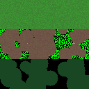
Expected result: three horizontal bands — green top, patchy middle, dark woodland blobs bottom. Compare with the sample peak tile if unsure.
View the tile as an image
Stop here. Before you inspect pixel numbers, look at the tile with your eyes.
In the notebook — new cell:
img = np.array(Image.open("../data/peak_tile.png"))

plt.figure(figsize=(5, 5))
plt.imshow(img)
plt.title("Synthetic Peak District aerial tile")
plt.axis("off")
plt.show()
You should see three horizontal bands: green grassland (top), patchy moor
(middle), dark woodland blobs (bottom). If the cell shows a blank square or an
error, check that ../data/peak_tile.png exists and re-run the save cell above.
In VS Code — click data/peak_tile.png in Explorer. The editor shows
the same image as a preview. You are looking at the same file the CNN will read —
not a separate copy.
Do not continue until you can see the tile both ways.
What the code does
We build a 128×128 colour image as a numpy array and save it. The view cell loads that file back and displays it — the same path a CNN uses.
Each pixel has three channels: R, G, B (0 = none, 255 = full brightness).
- The top band is bright green — improved grassland.
- The middle band is patchy purple-brown — heather moor and rough grazing.
- The bottom band is dark green blobs — scattered trees and woodland.
This is simplified, but it captures the idea: different land covers look different in colour and texture.
Section 2 — Inspect pixel values
Look with your eyes first
Open peak_tile.png in Explorer (or use the view cell from Section 1). Without
code, answer in your head — or jot in report/module2_notes.md:
- Which horizontal band looks brightest green — top, middle, or bottom?
- Which looks darkest overall?
- Tap or imagine one point in each band. Would you expect the middle number of RGB (green) to be highest in the top band?
You are making predictions. The code below checks what you already saw.
Question
What numbers sit at three points Andy marked on the map?
Code — confirm your predictions
img = np.array(Image.open("../data/peak_tile.png"))
print("Shape (height, width, channels):", img.shape)

points = {
    "grassland (top)": (20, 64),
    "moorland (middle)": (64, 64),
    "woodland (bottom)": (100, 64),
}

for name, (row, col) in points.items():
    r, g, b = img[row, col]
    print(f"{name:22s} row={row:3d} col={col:3d}  RGB=({r:3d}, {g:3d}, {b:3d})")
What the code does
img[row, col] returns [R, G, B]. Compare the printed numbers to your
predictions from above:
- Grassland (top) should show a high G (green) value.
- Woodland (bottom) should show low R and low G — darker overall.
- Moorland (middle) sits in between, often more red-brown.
If the numbers surprise you, look at the tile again at those row/column positions. The code is confirming what is already in the picture.
A CNN eventually learns these relationships automatically. Today you are reading them by hand.
Section 3 — Greenness profile
Look with your eyes first
Look at peak_tile.png again — full image, not zoomed to one pixel.
- Does the top third look more green overall than the bottom third?
- Do you expect a line graph of "greenness by row" to be higher at the top and lower at the bottom?
Sketch a rough answer (even a wavy line on paper). Then run the code — the chart should match what you already saw.
Question
Does the average green channel drop as we move down the image?
Code — draw the greenness chart
green_by_row = img[:, :, 1].mean(axis=1)

plt.figure(figsize=(8, 4))
plt.plot(green_by_row, color="green")
plt.xlabel("Row (top = sky side of photo)")
plt.ylabel("Average green channel")
plt.title("Greenness profile — synthetic Peak District tile")
plt.tight_layout()
plt.savefig("../outputs/charts/module2_green_profile.png", dpi=150)
plt.show()
print("Saved — also open ../outputs/charts/module2_green_profile.png in Explorer")
What the code does
For each row of the image we average the green channel across all columns. That produces one number per row — a simple summary of "how green is this strip of the photo?"
The line should be higher where you saw bright grass and lower where you saw dark woodland. If the chart contradicts your eyes, re-open the tile and find out why (mixed bands, one dark blob, etc.) before moving on.
This is a very simple feature — one number summarising part of the image. CNNs learn richer features, but the idea starts here: look first, then measure.
Reflection questions
- If you showed only the RGB triple
(25, 70, 35)to a friend, could they guess woodland? What about a whole 32×32 patch? - Why might averaging one row be too crude to map the whole Peak District?
- Did manipulating arrays feel similar to working with pandas tables?
Manager feedback
From: Andy Ipping
Good. You now see what I see when I open a GeoTIFF from a drone flight: a big numeric array.
Colour alone is not enough — moor and woodland can both look dark. Tomorrow we look at texture: the small patterns that distinguish rough heather from a smooth grass field.
— Andy
AQA Mathematics links
- Arrays and matrices — images as 2D and 3D structures
- Averages — summarising rows and regions
Beyond A-Level
Search for RGB vs multispectral satellite bands. Professional land mapping often uses wavelengths the human eye cannot see (e.g. near-infrared), which makes separating vegetation types easier.
Module 3 — Filters & Textures
Manager email
From: Andy Ipping
Subject: Edge filters — how computers "feel" textureTwo fields can both look green. One is smooth pasture, one is rough tussock grass. The difference is texture — how much the brightness changes from pixel to pixel.
CNNs use small filters (also called kernels) that slide across the image and highlight patterns. Today you'll run one by hand with numpy — no neural network yet.
Apply a simple edge-detection filter to
peak_tile.png. Save the result asoutputs/charts/module3_edges.pngand write three sentences on what got highlighted.— Andy
Why this matters
The core operation inside a CNN is called convolution: multiply a small grid of weights by a patch of the image and sum the result. Repeat everywhere.
You are about to do exactly that manually. Once you have felt it with your own code, CNNs become "many filters, learned from data" instead of a black box.
What you'll learn
- What a convolution filter does, in plain language
- Why edges and texture matter for land-cover mapping
- How to apply a 3×3 kernel with numpy (no ML library required)
Step 1 — Create the notebook
notebooks/module3_filters.ipynb
You will implement convolution with a pixel loop — the same operation a
Conv2D layer automates in Module 5.
Section 1 — Greyscale simplifies the story
Question
Can we focus on brightness only?
Code
import numpy as np
from PIL import Image
import matplotlib.pyplot as plt

img = np.array(Image.open("../data/peak_tile.png"))
# Standard luminance weights for RGB → grey
grey = (0.299 * img[:, :, 0] + 0.587 * img[:, :, 1] + 0.114 * img[:, :, 2])

plt.imshow(grey, cmap="gray")
plt.title("Greyscale aerial tile")
plt.axis("off")
plt.show()
What the code does
We combine R, G and B into one greyscale value per pixel. Many edge filters work on greyscale first. Colour comes back later when we need to distinguish heather from woodland.
Section 2 — A simple edge filter
Look with your eyes first
Before any edge code, open peak_tile.png and find boundaries yourself:
- Where does the bright green top meet the middle band?
- Where does the middle meet the dark woodland bottom?
- Inside the middle band, do you see spotty patches (busy texture) compared to the smoother top?
Mark them mentally or trace on paper. These are edges your eye already sees. The filter below should light up those same places — if it does not, something went wrong.
Question
Does the edge filter highlight the boundaries you already spotted?
Code — run the filter and compare
kernel = np.array([
    [-1, 0, 1],
    [-2, 0, 2],
    [-1, 0, 1],
], dtype=float)

h, w = grey.shape
edges = np.zeros((h - 2, w - 2))

for row in range(1, h - 1):
    for col in range(1, w - 1):
        patch = grey[row - 1 : row + 2, col - 1 : col + 2]
        edges[row - 1, col - 1] = np.sum(patch * kernel)

fig, axes = plt.subplots(1, 2, figsize=(10, 4))
axes[0].imshow(grey, cmap="gray")
axes[0].set_title("Original greyscale")
axes[0].axis("off")
axes[1].imshow(np.abs(edges), cmap="inferno")
axes[1].set_title("Vertical edges (absolute values)")
axes[1].axis("off")
plt.tight_layout()
plt.savefig("../outputs/charts/module3_edges.png", dpi=150)
plt.show()
print("Saved — open module3_edges.png in Explorer and compare to peak_tile.png")
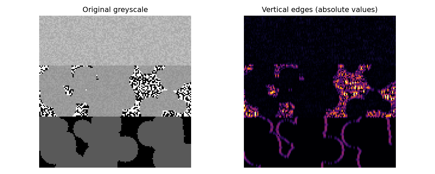
Expected result: bright horizontal lines at the three band boundaries; busier texture in the middle (moor) band. See the sample edge chart.
What the code does
Left panel: greyscale tile — same as your eyes saw, minus colour.
Right panel: filter output. Bright pixels = strong vertical edges (big left–right brightness change). Dark = smooth areas.
Check the horizontal boundaries between the three bands — they should glow. Check the patchy moor — often brighter than smooth grass because texture creates many small edges.
If the bright lines match the boundaries you marked before coding, the matrix did its job: it measured what you already saw.
This sliding-window multiply-and-sum is convolution. CNNs learn the kernel
values automatically instead of us writing [-1, 0, 1, ...].
Section 3 — Compare land bands
Look with your eyes first
Look at the three horizontal bands in peak_tile.png again:
- Which band looks smoothest?
- Which looks busiest (most spots, blobs, or contrast)?
Guess which will score highest on "edge strength" before you run the code.
Question
Does the busiest-looking band match the highest edge numbers?
Code — confirm with averages
regions = {
    "grassland": grey[: grey.shape[0] // 3, :],
    "moorland": grey[grey.shape[0] // 3 : 2 * grey.shape[0] // 3, :],
    "woodland": grey[2 * grey.shape[0] // 3 :, :],
}

for name, band in regions.items():
    eh, ew = band.shape
    e = np.zeros((eh - 2, ew - 2))
    for row in range(1, eh - 1):
        for col in range(1, ew - 1):
            patch = band[row - 1 : row + 2, col - 1 : col + 2]
            e[row - 1, col - 1] = abs(np.sum(patch * kernel))
    print(f"{name:12s}  mean edge strength: {e.mean():.2f}")
What the code does
We measure average edge strength in each horizontal band. The ranking should match your eyeball guess from above — usually moorland and woodland show more texture than uniform grass.
If the numbers disagree with your eyes, trust your eyes first and debug (wrong band split, filter direction, etc.).
Your written task
Add report/module3_filter_note.md with three sentences:
- What did the edge filter highlight — and did it match what you saw before running the code?
- Which land type had the strongest average edges — and did that match your eyeball guess?
- Why might edge strength alone not be enough to map the whole Peak District?
Reflection questions
- The loop over pixels is slow. Production code uses optimised libraries — but the maths is identical. Does knowing the maths make you trust the tool more?
- Could you design a filter that detects "blobbiness" instead of edges?
Manager feedback
From: Andy Ipping
You just implemented the heart of a CNN layer. Professional models use dozens of filters at once — some find edges, some find spots, some find stripes — and later layers combine those patterns into "this looks like heather."
Next module: the full CNN story, still keeping the jargon light.
— Andy
AQA Mathematics links
- Matrix multiplication — each 3×3 patch times a 3×3 kernel
- Gradients and rates of change — edges as sharp brightness change
Beyond A-Level
Look up 2D convolution in image processing. The notation is more formal, but you already ran a working example.
Module 4 — How CNNs Think
Manager email
From: Andy Ipping
Subject: From filters to the two-pass CNNs in the published pipelineYou can spot grass, heather moor and woodland because your brain builds patterns. Our production system does something similar — in two passes:
- High-level classes — moorland, woodland, grassland (~95% accuracy).
- Subclasses — heather moor, deciduous woodland, wet grassland and rush pasture, and others (typically 72–92%).
Thijs van der Plas (Turing Institute) and Cranfield designed this multi-stage semantic segmentation approach because rare habitats are easily drowned out in a single model. Today you explain that pipeline back to me before we train anything in Module 5.
Write
report/module4_cnn_explainer.md(400–600 words) and sketch a diagram. Reference our MDPI Remote Sensing paper (2023) if helpful — you do not need every class code.— Andy
Why this matters
Most introductions either drown you in layer names or wave their hands and say "it's like the brain." Neither helps. The useful mental model is a pipeline:
- Small filters scan the image and fire on local patterns (edges, blobs, colour patches).
- Pooling shrinks the map — "was there strong edge activity here?" without remembering every exact pixel.
- Deeper layers combine earlier patterns — edges + dark green blobs → "tree canopy texture."
- Final layer outputs scores for each class: 70% grassland, 20% moorland, 10% woodland.
None of this requires you to label pixels by hand at the end. You label whole example patches during training; the network learns which filters help.
What you'll learn
- The two-pass CNN story without heavy maths
- Why labelled training data matters
- How a Peak District patch becomes a land-cover label
- Limits: when CNNs fail (clouds, shadows, rare classes)
The pipeline — read this carefully
Imagine a 64 m × 64 m patch from a Bluesky tile over the Dark Peak — the same patch size used in the published project.
Stage 1 — High-level segmentation (Pass 1)
Dozens of learned filters slide across the patch — like your Module 3 loop, but trained on 1,027 hand-labelled patches sampled across the park. The network predicts broad classes: moorland, woodland, grassland, arable, and others from the Taylor schema.
Output: a coarse habitat mask. Accuracy here is typically around 95% — similar to human interpreters working at this scale.
Stage 2 — Subclass segmentation (Pass 2)
The high-level mask restricts where subclasses are predicted — heather moor only inside moorland, deciduous woodland only inside woodland. This is why rare classes like wet grassland and rush pasture (F3d) survive training instead of being ignored.
Subclass accuracy is lower (72–92%) because categories look similar from above and because some habitats are naturally fragmented.
Stage 3 — Merge with Ordnance Survey
CNN output does not include buildings and roads reliably. The published project merges predictions with OS topographic layers for a complete map rangers can navigate.
Stage 4 — Use in monitoring
The finished map supports Landscape Recovery, tracks nature recovery indicators, and directs field work — e.g. where to survey for water voles beyond obvious stream edges.
Training in one paragraph
You show the network thousands of labelled patches: "this 32×32 tile is grassland," "this one is woodland." It guesses, compares to your labels, and nudges filter weights to reduce mistakes — backpropagation and gradient descent do the nudging. You do not need the calculus this week; you need to know labels teach the filters.
Where CNNs struggle
Be honest in your report about limitations:
| Problem | Example in the Peak District |
|---|---|
| Different flight dates | Seven APGB capture dates — shadows and colour vary |
| Mixed pixels | One 64 m patch half grass, half path |
| Rare subclasses | Wet grassland fragments — few training patches |
| Seasonal change | Heather purple in autumn, brown in winter |
| Change over time | 2010 vs 2020 imagery — active research (Turing DSG) |
Professional teams combine CNNs with ground truth visits, multispectral bands, and time series (photos across seasons). Your tiny model is the first step in that world, not the final product.
Your tasks
Create report/module4_cnn_explainer.md covering:
- The scenario — one paragraph on mapping the Peak District from above.
- The four stages — convolution, pooling, deeper layers, classification — in your own words, no copy-paste from this page.
- A diagram — boxes and arrows from "aerial photo patch" to "label: grassland / moorland / woodland."
- One limitation — when would you not trust the model alone?
Reflection questions
- Does the filter idea from Module 3 make the CNN feel less mysterious?
- Would you rather design filters by hand or train them from data?
- Who should decide what happens when the model is 60% confident?
Manager feedback
From: Andy Ipping
If you can explain this to a ranger without saying "tensor," you're already ahead of many graduate applicants.
Tomorrow you train a miniature version on synthetic tiles. It will not change national policy — but it will prove you understand the loop: data → model → prediction → map.
— Andy
AQA Mathematics links
- Functions and composition — layers feeding layers
- Probability — softmax outputs as percentages
Beyond A-Level
Search for CNN feature visualisation (e.g. "what did layer 1 learn?"). You'll see edge detectors that look remarkably like the Sobel filter you coded.
Module 5 — Train a Tiny Classifier
Manager email
From: Andy Ipping
Subject: Smallest useful CNN — not production, but same logicThe PDLL teaching pipeline uses deep semantic segmentation on 512 × 512 patches in the published project. Your exercise uses smaller synthetic 32 × 32 tiles — three teaching classes standing in for grassland, moorland and woodland — so you feel the training loop before EuroSAT in 201 or the public
pdnpa/cnn-land-coverpatches.Train a tiny CNN with TensorFlow. Report accuracy on a held-out test set. Then classify a new "mystery" mosaic and save
outputs/charts/module5_land_map.png.Deliverables:
notebooks/module5_tiny_cnn.ipynboutputs/charts/module5_land_map.png- Short note in
report/module5_results.md(150–250 words)— Andy
Why this matters
This is the full loop in miniature — the same loop used for national land-cover products, just with toy data you can train in a few minutes on a laptop.
You will feel how much data labels matter and how accuracy numbers can look good on synthetic tiles but mean little until ground-checked.
What you'll learn
- How to generate labelled image patches for training
- How to build and train a minimal CNN in Keras
- How to read a confusion matrix in plain language
- How predictions on a grid become a simple land-cover map
Step 1 — Create the notebook
notebooks/module5_tiny_cnn.ipynb
If test accuracy stays below 85% after 12 epochs, try epochs=20.
Section 1 — Generate labelled patches
Question
Can we create many small examples of each land type?
Code
import numpy as np
from PIL import Image
import matplotlib.pyplot as plt

CLASSES = ["grassland", "moorland", "woodland"]
rng = np.random.default_rng(7)

def random_tile(class_id):
    """Return a 32x32 RGB patch for one land class."""
    patch = np.zeros((32, 32, 3), dtype=np.uint8)
    if class_id == 0:  # grassland
        patch[:, :, 1] = rng.integers(120, 160, size=(32, 32))
        patch[:, :, 0] = rng.integers(40, 70, size=(32, 32))
        patch[:, :, 2] = rng.integers(30, 60, size=(32, 32))
    elif class_id == 1:  # moorland
        patch[:, :, 0] = rng.integers(90, 130, size=(32, 32))
        patch[:, :, 1] = rng.integers(60, 100, size=(32, 32))
        patch[:, :, 2] = rng.integers(50, 80, size=(32, 32))
        for _ in range(8):
            cx, cy = rng.integers(0, 32, size=2)
            r = rng.integers(2, 6)
            y, x = np.ogrid[-cy : 32 - cy, -cx : 32 - cx]
            mask = x * x + y * y <= r * r
            patch[mask] = [130, 90, 75]
    else:  # woodland
        patch[:, :, :] = np.array([30, 55, 30])
        for _ in range(6):
            cx, cy = rng.integers(0, 32, size=2)
            r = rng.integers(3, 10)
            y, x = np.ogrid[-cy : 32 - cy, -cx : 32 - cx]
            mask = x * x + y * y <= r * r
            patch[mask] = [20, rng.integers(50, 90), 25]
    return patch

n_per_class = 300
X_list, y_list = [], []
for class_id in range(3):
    for _ in range(n_per_class):
        X_list.append(random_tile(class_id))
        y_list.append(class_id)

X = np.stack(X_list).astype("float32") / 255.0
y = np.array(y_list)

fig, axes = plt.subplots(1, 3, figsize=(8, 3))
for i, name in enumerate(CLASSES):
    axes[i].imshow(X[y == i][0])
    axes[i].set_title(name)
    axes[i].axis("off")
plt.tight_layout()
plt.show()
Look with your eyes first
The cell above shows one example of each class. Before training, describe each in plain English (colour, texture, blobs). Could you tell them apart? If yes, the CNN has something to learn. If no, the labels are too ambiguous.
What the code does
We create 900 patches (300 per class) with random noise so the model cannot memorise one perfect image. Values are scaled to 0–1 for neural networks.
Section 2 — Train / test split
Code
from sklearn.model_selection import train_test_split

X_train, X_test, y_train, y_test = train_test_split(
    X, y, test_size=0.2, stratify=y, random_state=0
)
X_train.shape, X_test.shape
Install scikit-learn if needed: pip install scikit-learn
Section 3 — Build a tiny CNN
Question
Can three layers learn our synthetic patterns?
Code
import tensorflow as tf
from tensorflow import keras

model = keras.Sequential([
    keras.layers.Conv2D(16, 3, activation="relu", input_shape=(32, 32, 3)),
    keras.layers.MaxPooling2D(2),
    keras.layers.Conv2D(32, 3, activation="relu"),
    keras.layers.MaxPooling2D(2),
    keras.layers.Flatten(),
    keras.layers.Dense(64, activation="relu"),
    keras.layers.Dense(3, activation="softmax"),
])

model.compile(
    optimizer="adam",
    loss="sparse_categorical_crossentropy",
    metrics=["accuracy"],
)
model.summary()
What the code does
This stack is the same story as Modules 3–4, packaged for Keras:
- Conv2D = sliding filters you coded by hand — here the computer learns the matrix values.
- MaxPooling = "any strong pattern in this neighbourhood?"
- Dense + softmax = final vote: e.g. 62% grassland, 28% moorland, 10% woodland.
This is a real CNN — just very small.
Section 4 — Train
Code
history = model.fit(
    X_train, y_train,
    validation_split=0.15,
    epochs=12,
    batch_size=32,
    verbose=1,
)

test_loss, test_acc = model.evaluate(X_test, y_test, verbose=0)
print(f"Test accuracy: {test_acc:.1%}")
Training should reach high accuracy on this synthetic task (>90%). If not, run a few more epochs — the data are separable.
Section 5 — Confusion matrix
Look with your eyes first
Before opening the matrix: which two classes looked most similar in Section 1? Guess which pair the model will confuse. Then run the code and see if you were right.
Code
from sklearn.metrics import confusion_matrix, ConfusionMatrixDisplay

y_pred = model.predict(X_test, verbose=0).argmax(axis=1)
cm = confusion_matrix(y_test, y_pred)

disp = ConfusionMatrixDisplay(cm, display_labels=CLASSES)
disp.plot(cmap="Blues", xticks_rotation=45)
plt.title("Where does the tiny CNN get confused?")
plt.tight_layout()
plt.show()
Read the matrix: rows are true class, columns are predicted. Off-diagonal cells are mistakes — which pair confuses the model?
Section 6 — Map a mosaic
Build a larger synthetic strip and classify each 32×32 window.
Look with your eyes first
Mark which third should be grass, moor and woodland before the model runs.
Code — build and view the mosaic
rng = np.random.default_rng(99)
H, W = 96, 192
mosaic = np.zeros((H, W, 3), dtype=np.uint8)

def fill_band(mosaic, row_start, row_end, class_id):
    """Stamp 32×32 tiles across each row (works for any width divisible by 32)."""
    for row in range(row_start, row_end):
        tile = random_tile(class_id)
        for c0 in range(0, W, 32):
            mosaic[row, c0 : c0 + 32] = tile[row % 32]

fill_band(mosaic, 0, H // 3, 0)
fill_band(mosaic, H // 3, 2 * H // 3, 1)
fill_band(mosaic, 2 * H // 3, H, 2)

plt.figure(figsize=(8, 4))
plt.imshow(mosaic)
plt.title("Input mosaic — look before you classify")
plt.axis("off")
plt.show()
Code — classify each window and compare
pred_map = np.zeros((H // 32, W // 32), dtype=int)
for i in range(H // 32):
    for j in range(W // 32):
        patch = mosaic[i * 32 : (i + 1) * 32, j * 32 : (j + 1) * 32]
        x = patch.astype("float32") / 255.0
        x = x.reshape(1, 32, 32, 3)
        pred_map[i, j] = model.predict(x, verbose=0).argmax()

fig, axes = plt.subplots(1, 2, figsize=(10, 4))
axes[0].imshow(mosaic)
axes[0].set_title("Input mosaic")
axes[0].axis("off")
axes[1].imshow(pred_map, cmap="viridis", vmin=0, vmax=2)
axes[1].set_title("CNN prediction map")
axes[1].set_xticks([])
axes[1].set_yticks([])
plt.tight_layout()
plt.savefig("../outputs/charts/module5_land_map.png", dpi=150)
plt.show()
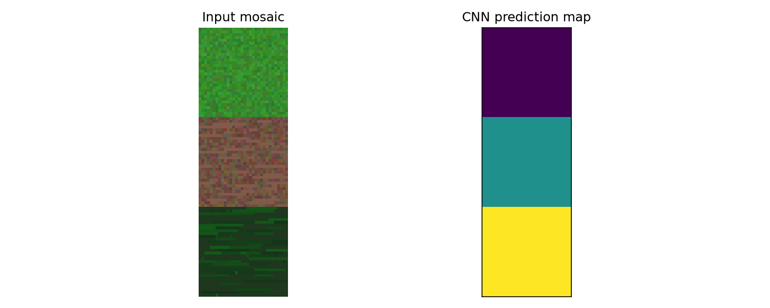
Does the right-hand map match the three bands you saw on the left?
Expected result: three horizontal colour bands on the left; three matching stripes in the prediction map. See the sample prediction map.
What the code does
Each window is classified independently — a naive but clear version of how operational systems tile huge aerial surveys. Professional pipelines add overlap and smoothing so windows do not disagree at boundaries.
Your written task
report/module5_results.md should include:
- Your test accuracy (one sentence).
- One confusion you noticed — e.g. "moorland sometimes classified as woodland."
- One limitation of applying this toy model to real Peak District imagery.
Reflection questions
- Did training feel like "statistics with pictures"?
- Would you trust this map for a legal subsidy form without ground checks?
- Which did you enjoy more — building the model or explaining results?
Manager feedback
From: Andy Ipping
Well done. You trained a CNN that beats guessing by a mile on synthetic tiles. Real work adds: georeferencing (each pixel has a map coordinate), class imbalance, and rangers who argue with your labels.
The skill you practiced — turning photos into decisions — is the same skill whether the client is a national park or a crop-insurance firm.
— Andy
AQA Mathematics links
- Probability — softmax outputs
- Optimisation — training minimises loss (gradient descent at A-Level Further)
Beyond A-Level
Look up U-Net and semantic segmentation — the step beyond patch classification where every pixel gets a label, not just the centre of a window.
Module 6 — What You Have Learned
By the end of CNN 101, you will understand:
- why organisations map 1,439 km² of national park from Bluesky APGB photography;
- how orthophotos are stored as RGB number grids;
- how convolution filters relate to CNN layers;
- how two-pass (high-level then subclass) segmentation works in production;
- how a simplified training loop relates to the full published pipeline.
If you enjoyed writing the pipeline in code, continue to Computer Vision Developer 201.
If you prefer interpreting maps and briefing rangers, see Computer Vision Analyst 101 instead.
Final reflection
Answer in report/module6_reflection.md (200–300 words):
- Would you enjoy this as a career — coding, maps, and client context together?
- What felt most surprising about CNNs once you saw pixels and filters first?
- What would you want to learn next — satellite data, bigger models, or the conservation policy side?
Manager feedback
From: Andy Ipping
You are not ready to retrain the production two-pass model. But you now know the story behind every map layer we publish: Bluesky pixels → staged CNNs → OS merge → monitoring use.
Computer Vision Developer 201 uses public EuroSAT tiles to practice evaluation and transfer learning. Compare your results to the public github.com/pdnpa/cnn-land-cover dataset when you are ready.
Thank you for your work this week. — Andy
Next steps: Computer Vision Developer 201 for real EuroSAT imagery and transfer learning. For a broader ML path, see Machine Learning 101.